Krea 2 deep dive: exploration, style references, and moodboards
by The Krea Team
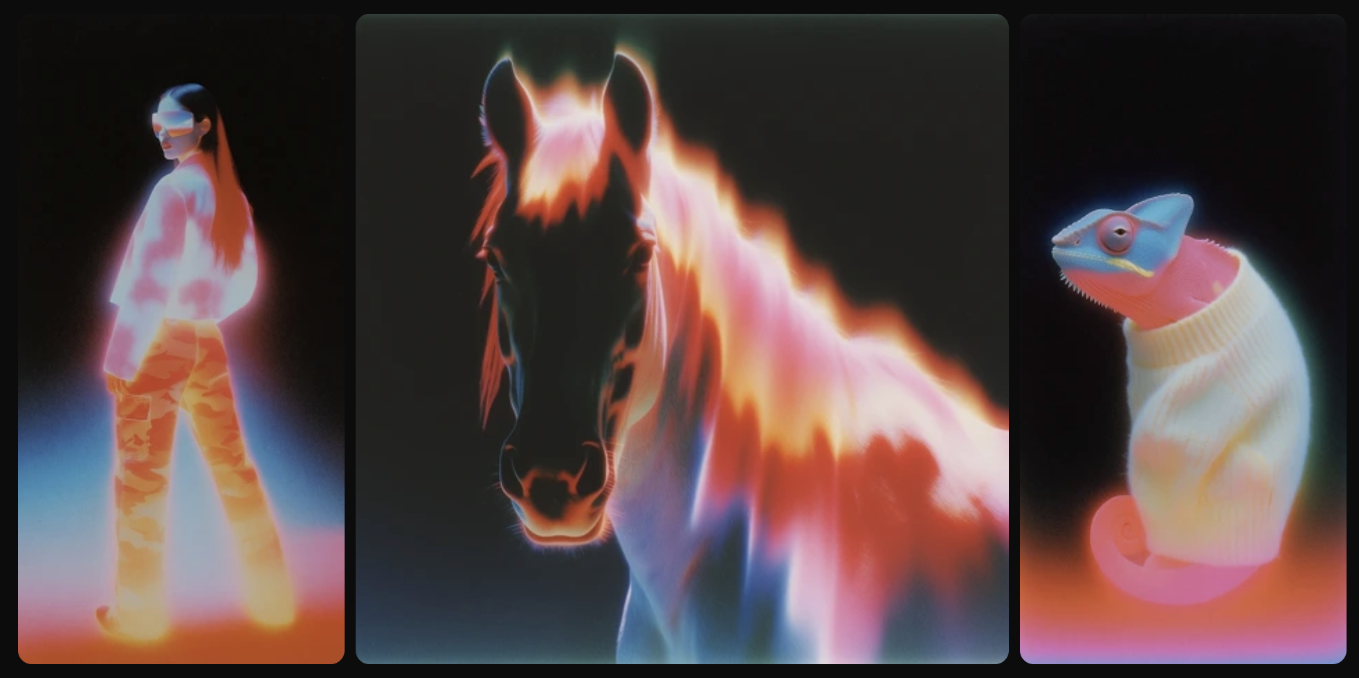
Krea 2 is our first foundation model, built completely from scratch and focused on aesthetics and creative control.
When you make an image with AI there are really two questions: what you want in the image, and how you want it to look.
Most models are great at the first. They handle complex prompts without breaking a sweat.
But when it comes to style they default to something polished, safe, and a little generic — the AI look.
We've talked before about that AI look and the barriers it creates when you're trying to get something expressive or artistic out of a model. For Krea 2 we wanted to take it head-on.
We put as much work into how an image looks as into the model itself.
The goal was something capable of rendering almost any style — from the grainiest film photography to the cleanest studio shot, cinematic stills, illustration, digital painting, and weirder experimental territory.
And just as importantly, something you can steer, not just prompt at.
The reason matters.
The kinds of products and features we've been able to build at Krea have always been limited by the models we had access to.
Starting our own research lab means we can finally make the technology that lets us build creative tools that treat AI as an actual creative medium — raw, flexible, unopinionated, uncut.
Something you can break if you want to, that doesn't quietly box you into the same handful of looks.
This post is a walkthrough of the three things that make that possible in Krea 2: open-ended exploration in the image tool, style references, and moodboards.
Start vague. Let the model explore.
Krea 2 doesn't expect a fully-formed idea.
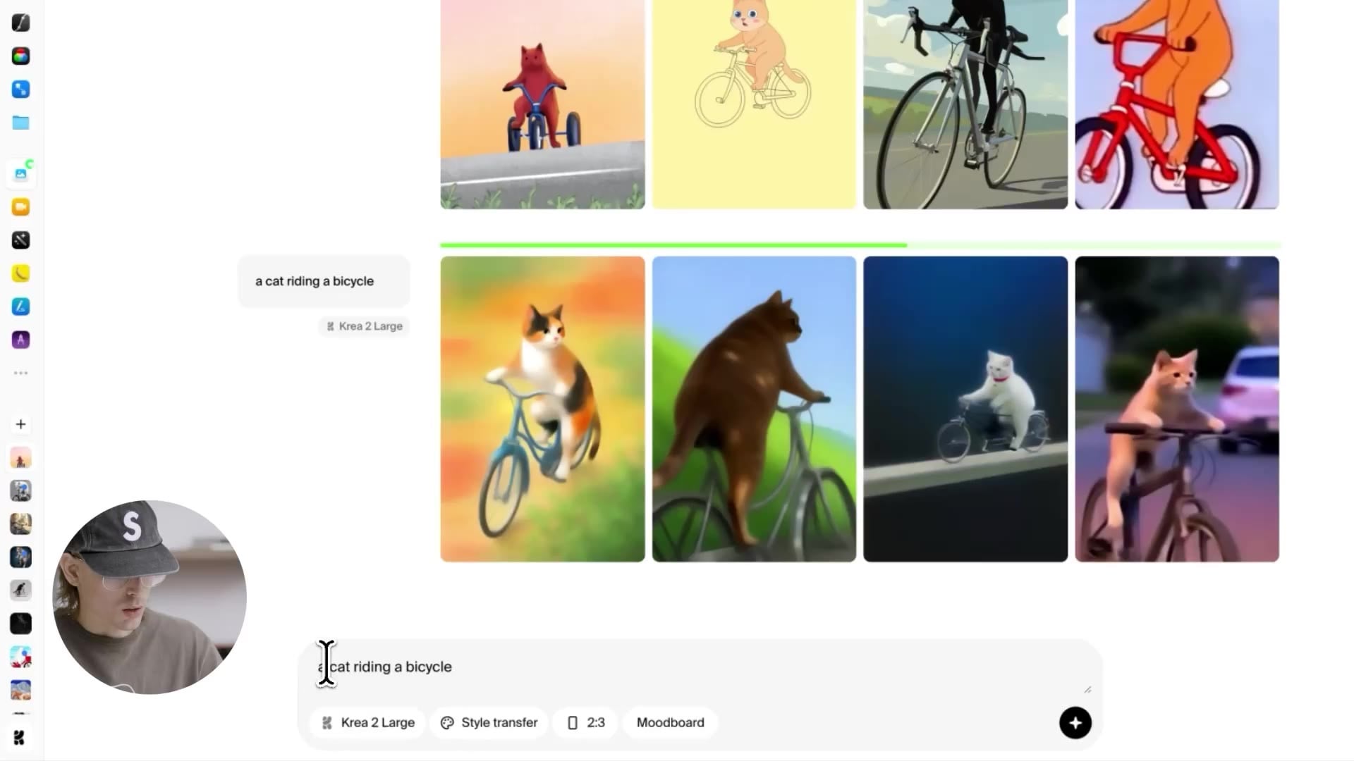
You can come into the image tool with something as bare as a cat riding a bicycle and just hit generate two or three times.
What comes back isn't four variations on a single safe interpretation — it's the model thinking through completely different ways that concept could be rendered.
Painting. Old VHS photography. Minimal illustration. Abstract shapes with their own internal logic.
The first round of generations becomes a kind of mood-sweep — a way to see what kinds of images even live inside this prompt, before you commit to any one of them.
This is a different posture than what most image models train you into.
You don't have to come in with a detailed brief.
You can use the first three generations as research, find the direction you like, and then narrow from there.
It's closer to the way an art director works — start broad, then home in — than the way most AI tools force you to write.
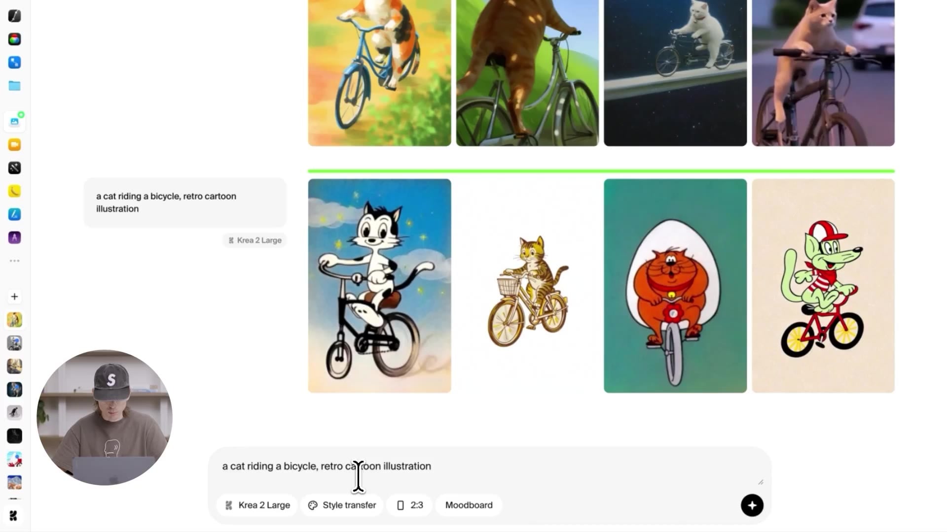
Tighten the prompt just a little — say, a cat riding a bicycle, retro cartoon illustration — and you still get diversity, but the cluster narrows.
All of them feel like retro cartoons; the variety lives inside that style.
Some are more complex, some more minimal, but they're all unmistakably retro cartoon.
The model isn't picking a single canonical interpretation of "retro cartoon" and printing it four times; it's exploring inside that style space.
The same thing works across radically different modes.
Switch the prompt to a cat riding a bicycle, dreamy cinematic scene at 16:9 and you get a whole spectrum of takes on that vibe — different lighting, different camera languages, different moods, all sitting comfortably under the same "dreamy cinematic" umbrella.
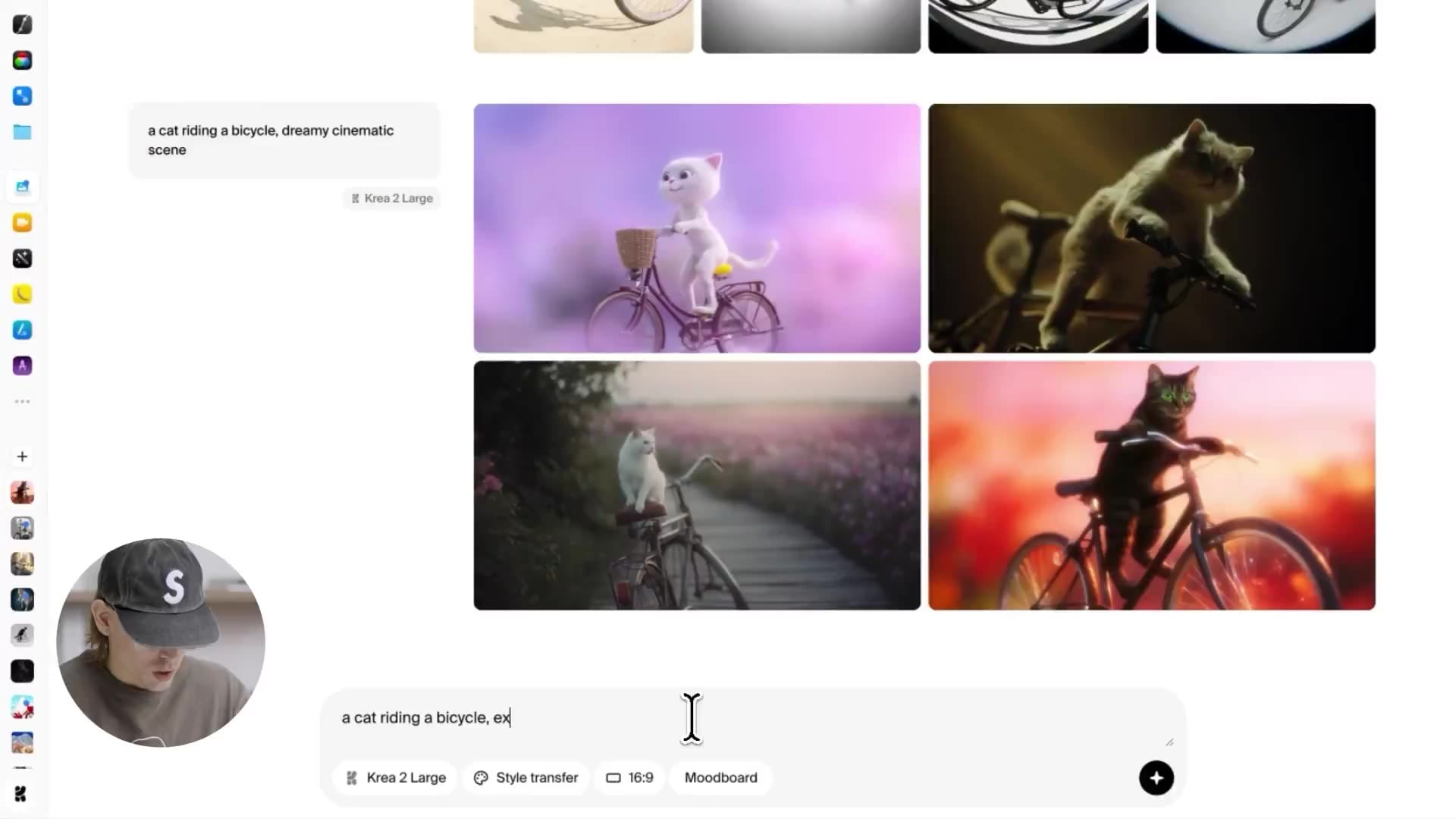
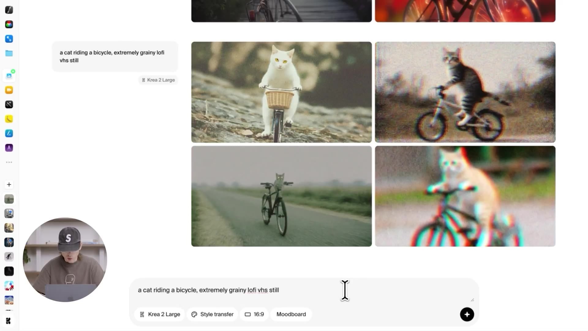
And if you want to push the model toward something less polished, you can.
Extremely grainy lo-fi VHS still gives you exactly that — low resolution, chromatic aberration, the kind of texture most models actively try to clean away.
This is where you can feel the unopinionated part of Krea 2 most clearly.
The model isn't holding back, isn't quietly steering you toward "tasteful," isn't softening the edges of the look you asked for.
Style references: dial the look up and down
Once you've found a look you like — whether it came out of one of these exploratory rounds or you brought it in from somewhere else — style references let you carry it forward into completely different prompts.
We spent as much time on the style transfer system as we did on the foundation model itself.
The way it works: you drag any image into the prompt box, into the area marked add as style transfer, and then you write whatever prompt you want.
Under the hood, the system extracts the stylistic components of that image — color, texture, composition cues, the painted-or-photographic feel of it — and applies them to your new generation.
So if you liked the painting style of one of those cat-on-bicycle outputs and want to see what it does with a completely different subject, you can.
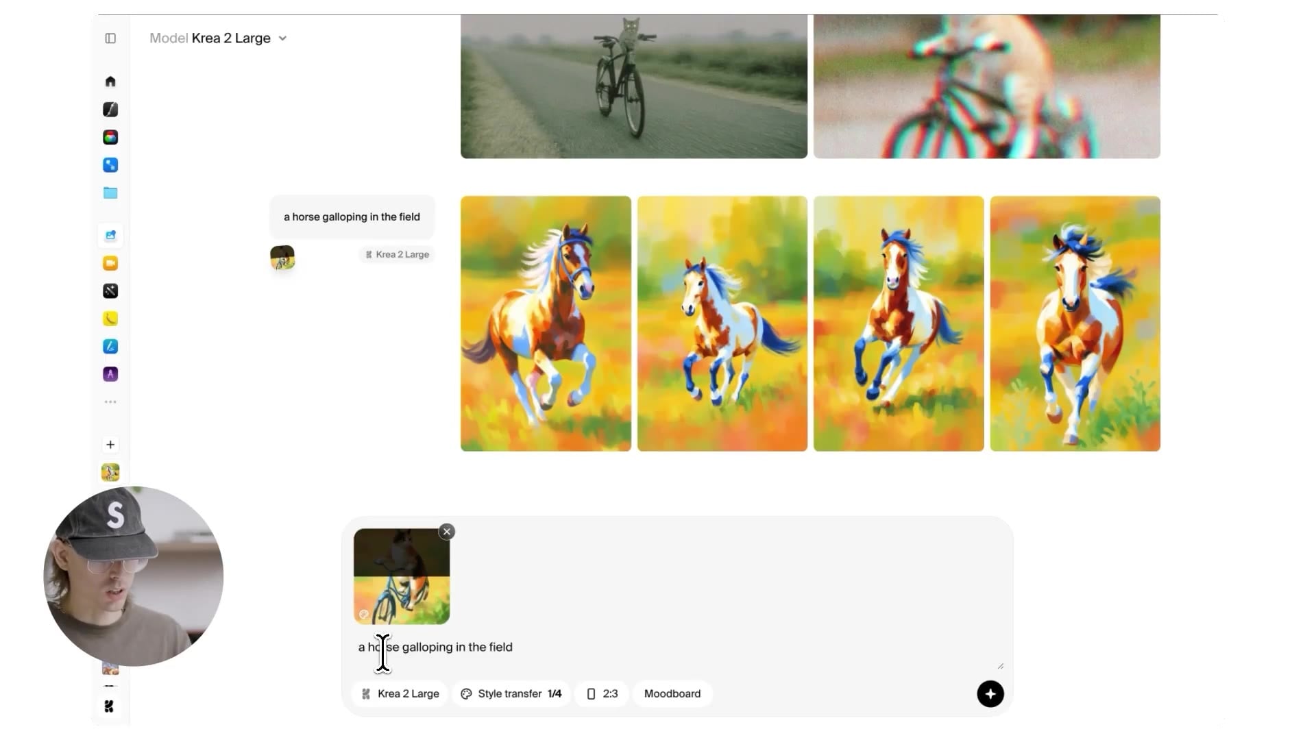
The most important knob here is strength.
Strength controls how hard the style pushes against the base model.
At 50% you get a balanced blend — recognizably stylized, but the prompt is still firmly in charge.
The interesting part is what happens at the extremes.
Drop the slider to 20% and the same prompt with the same reference produces something much more realistic.
You can still see hints of the reference: a touch of the color palette, a faint painted quality.
But the base model has the upper hand and it pulls the image toward photography.
This is useful when you want a style to inform a generation rather than dominate it — when you want a whiff of the reference instead of the whole thing.
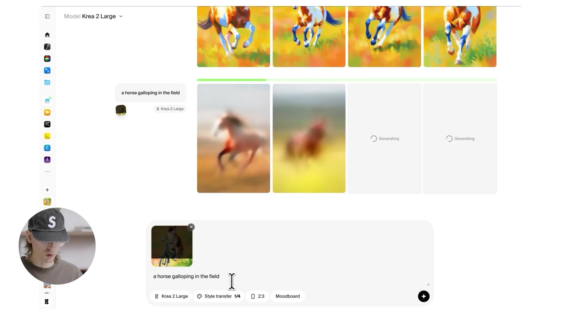
Push it the other way to 80% and the relationship inverts.
Now the reference is in charge.
You get a full painting in the same palette, the same brush strokes, the same compositional language as the reference image.
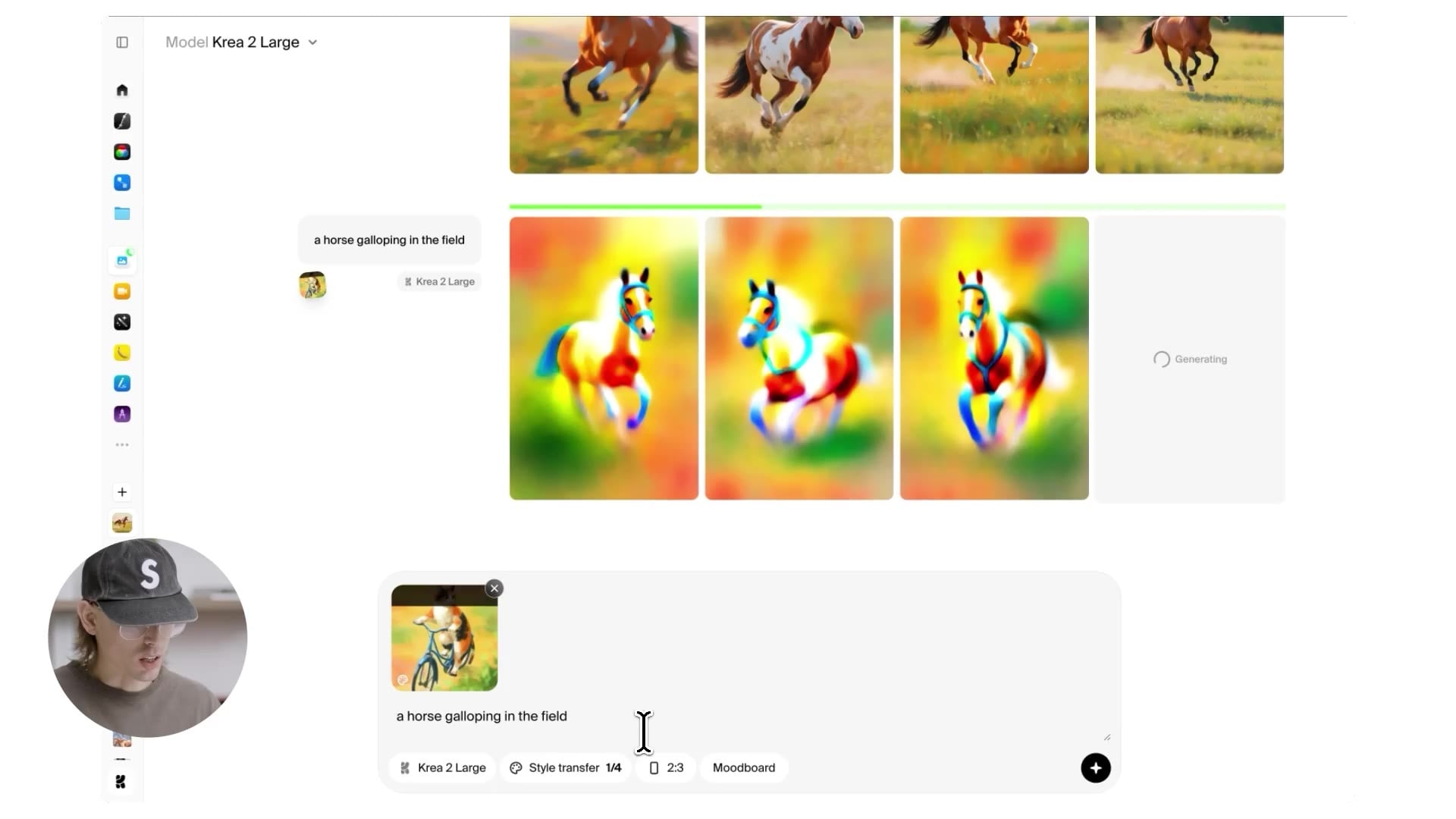
Push it even further and the model starts hunting for places to put the reference's color — sometimes overriding the subject itself to make the style fit.
You can see this in the outputs where the model tries so hard to transfer the bike's color into the horse that it starts painting parts of the horse itself in that color.
That kind of "breaking" is informative; it tells you exactly where the style transfer is trying to land.
The other thing you can do — and this is where style references really start to feel like a creative instrument — is combine them.
You can stack up to four references at once, each with its own strength slider.
Add a darker knight reference at 70% on top of an illustration at 50% and you start seeing the interesting part: stylistic components from both images coexisting in the same output.
The chrome and the darkness from the knight, the painted aberrations and the looser hand from the illustration.
The horse comes out partially chrome, partially painted, with backgrounds and lighting borrowed from both worlds.
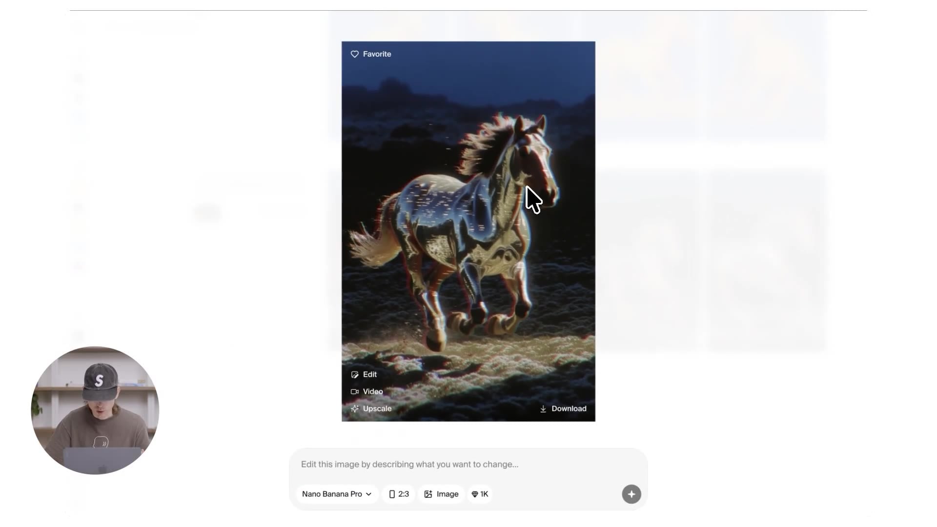
Re-balance the same two — illustration to 75%, knight down to 57% — and the result tilts toward the illustration: more of the painted artifacts, only certain parts of the horse rendered in chrome instead of the whole thing.
You can literally feel each slider pulling on a different aspect of the output.
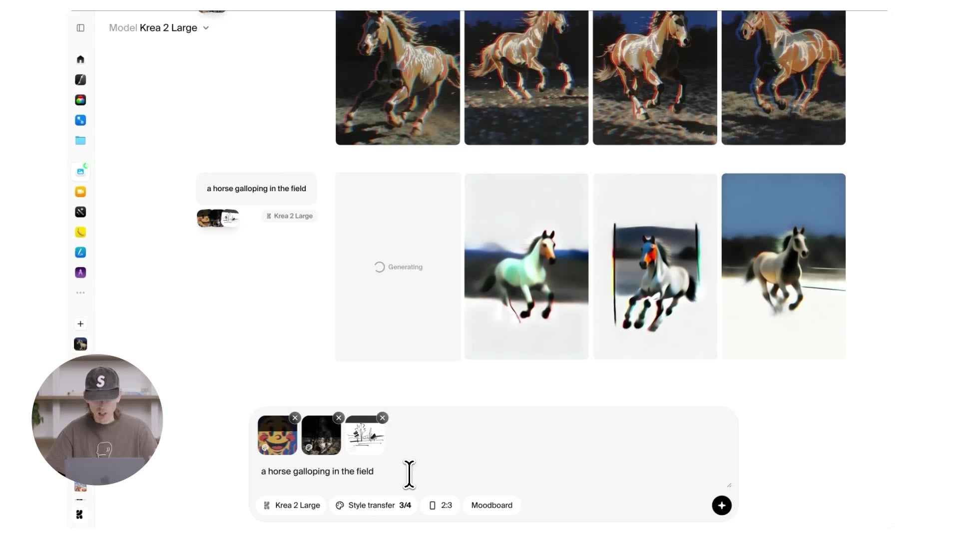
Add a third reference into the mix — a line illustration at 80% on top of the painting at 60% and the knight at 44% — and the whole process starts feeling less like prompting and more like turning physical knobs on a creative tool.
You don't have to write any new text.
You can move sliders, swap references, raise one and drop another, and watch the output rearrange itself in response.
For us this is the most honest answer to the question "how do you give an AI tool real creative control": you give the user variables that map to visual qualities and let them play.
Moodboards: a richer kind of reference
Style references are precise.
You hand the model a specific image, it extracts the style, you control how hard that style pushes.
Moodboards are the other new thing in Krea 2 and they work on a different axis. Two important differences:
- No four-image cap. You can throw as many images at a moodboard as you want. The whole point is that a moodboard is a set, not a single reference, and the system reasons over the set.
- The algorithm is doing more than style transfer. Moodboards use style transfer under the hood, yes, but on top of that they run custom LLMs and clustering across your images. They pick up on concepts, recurring characters, expressions, compositions, atmosphere — the actual mood of the set, not just its visual style.
The workflow is simple.
Open the sidebar in the image tool, click moodboards, create a new board, drop in a batch of images, and click analyze.
After a moment you get three columns back:
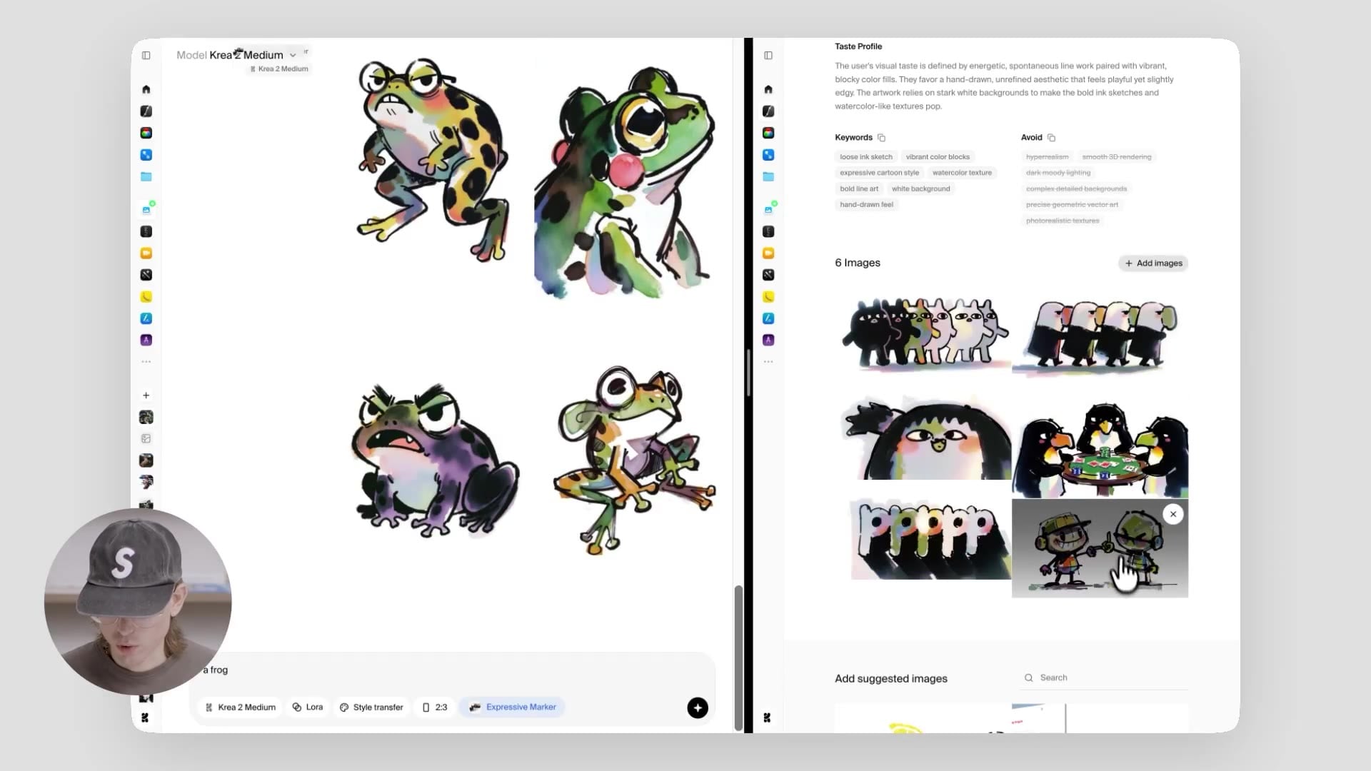
- Taste profile. A high-level description of the kinds of things the algorithms found in your moodboard. Useful both as a sanity check and as a kind of mirror — sometimes you see your own taste described back at you in a way you wouldn't have written yourself.
- Keywords. The set of style tags the system will use under the hood every time you generate with this board.
- Avoids. Things the system will actively steer away from when you generate with this board. This is one of the more underrated bits — being able to encode what you don't want is often more useful than being able to encode what you do.
Then you generate as usual.
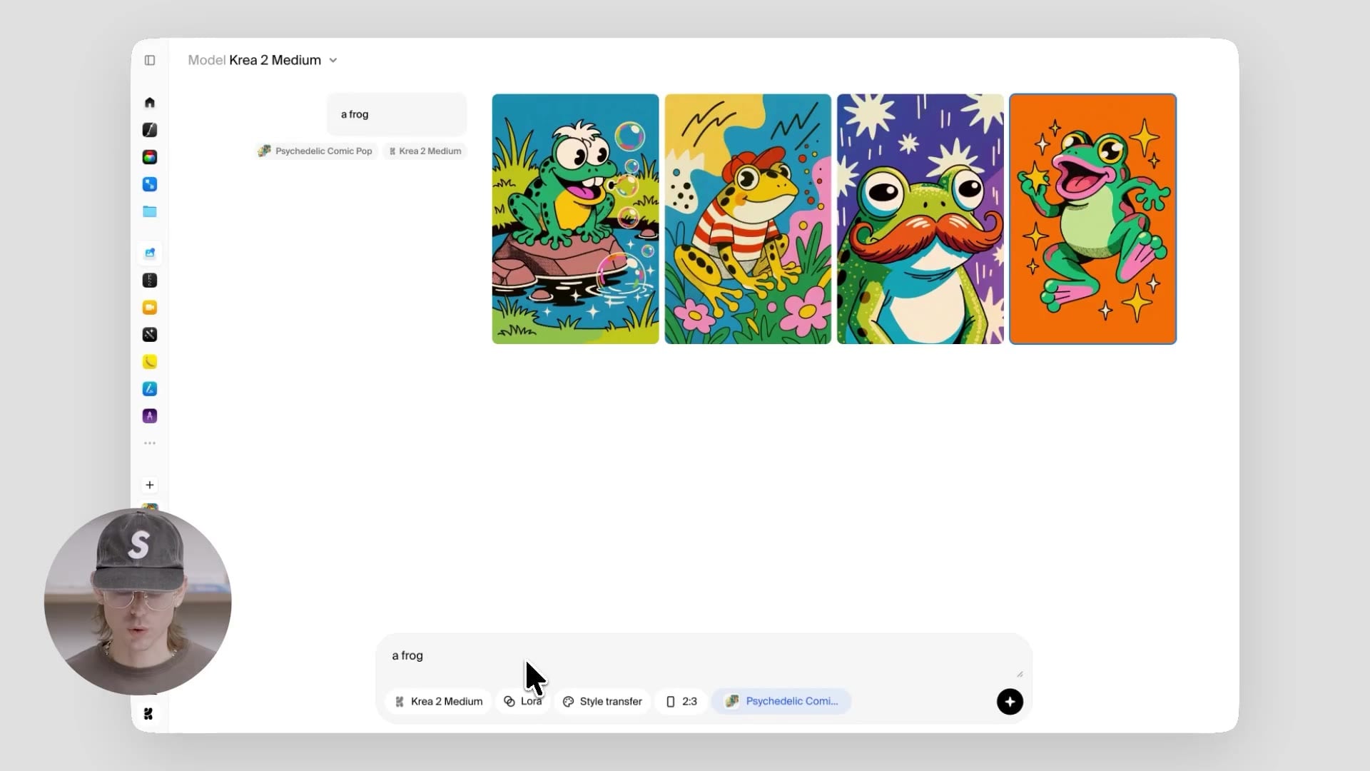
Prompt a frog against a board of colorful illustration and you get frogs that pull the palette and the line work — and sometimes go further, picking up incidental details like little stars from the references and weaving them into the scene.
The output isn't a "frog in the moodboard's style" so much as "what would happen if a frog existed inside this universe."
Sometimes that turns into the frog quietly watching its own bubbles like a confused tourist. That's the point.
We've also shipped a set of presets so you can play with the system before you build your own.
Each preset is a hand-curated moodboard with its own taste profile, keywords, and avoids — you can swap them in and out and instantly see the same prompt rendered through completely different aesthetic universes.
Retro web is one of our favorites.
Apply it to the same frog prompt and you get pixelated, slightly chaotic 3D-collage territory — bits of late-90s web aesthetic colliding with rendered objects and stickers.
Sometimes the outputs lean realistic-with-a-vibe, like a collage that almost makes sense; sometimes they go fully pipe-and-3D-blob. Both are correct.
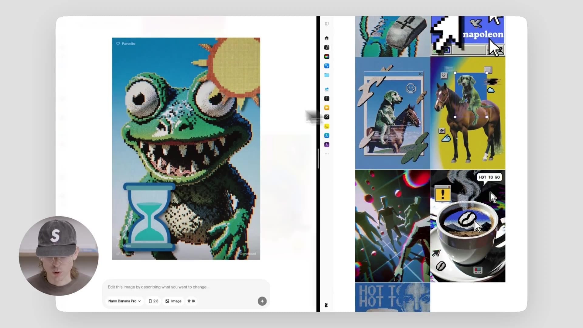
Expressive marker swings the same prompt into character territory.
The reference set is a bunch of expressive, slightly goofy illustrated characters, and the system keeps that mood consistent across whatever you generate with it.
The frog comes out looking a little funny, a little stylized, very obviously a character and not just an object in a style.
This is the part of moodboards that style references can't quite do on their own: transferring not just look but attitude.
The mental model that's worked best for us: where style references are about transferring a look with precision, moodboards are about handing the model a vibe and seeing what it does with it.\
Try it
Krea 2 gives you a lot of room to explore and a lot of aesthetic control.
Exploration mode for figuring out what you want.
Style references for carrying a specific look across prompts and dialing it in with strength.
Moodboards for handing the model a whole creative universe and letting it generate inside that universe.
They're designed to be used together — start with exploration, refine with style references, lock in an aesthetic universe with a moodboard — but each one stands on its own too.
The best way to feel the difference is to open the image tool and start pushing it.
Frequently asked questions
Krea 2 is our first foundation image model, built from scratch with a focus on aesthetics and creative control. It's designed to render a wide range of styles without defaulting to a generic, polished AI look.
Style references transfer the visual style of up to four images, with per-image strength controls — precise, surgical, great for carrying a specific look across prompts. Moodboards accept more images and use clustering plus custom LLMs to pick up concepts, characters, expressions, and overall mood — broader, more generative, great for handing the model a whole creative universe.
Up to four, each with its own strength slider. Most of the interesting territory shows up when you stack two or three.
Open the sidebar in the image tool. Moodboards is the second item.
After you analyze a moodboard, the system returns three columns. Taste profile describes what it found at a high level. Keywords are the style tags it will use under the hood. Avoids are things it will actively steer away from when generating with that board.
Yes. Krea has a free tier you can use to explore the image tool, style references, and moodboards.