
Krea Redesign
The Krea Team March 2, 2026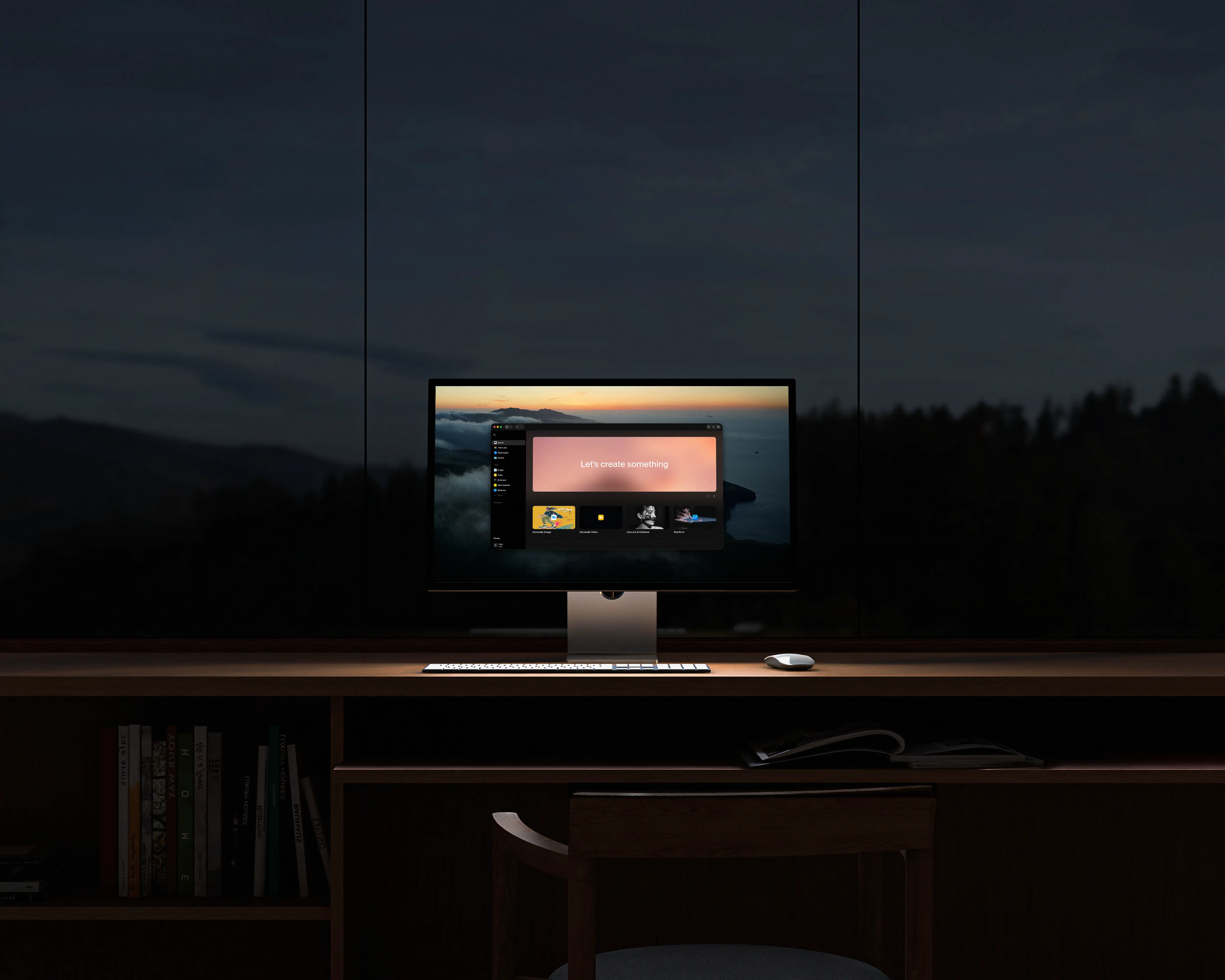
We redesigned every screen in Krea. New navigation, clearer model picking, drag-and-drop between tools, a workspace you can customize, and a mobile experience rebuilt from scratch.
The reason is simple: as we've added more tools and models, the app got harder to move around in. We went through every screen with one filter: is this helping you make something, or is it in the way. Here is what changed:
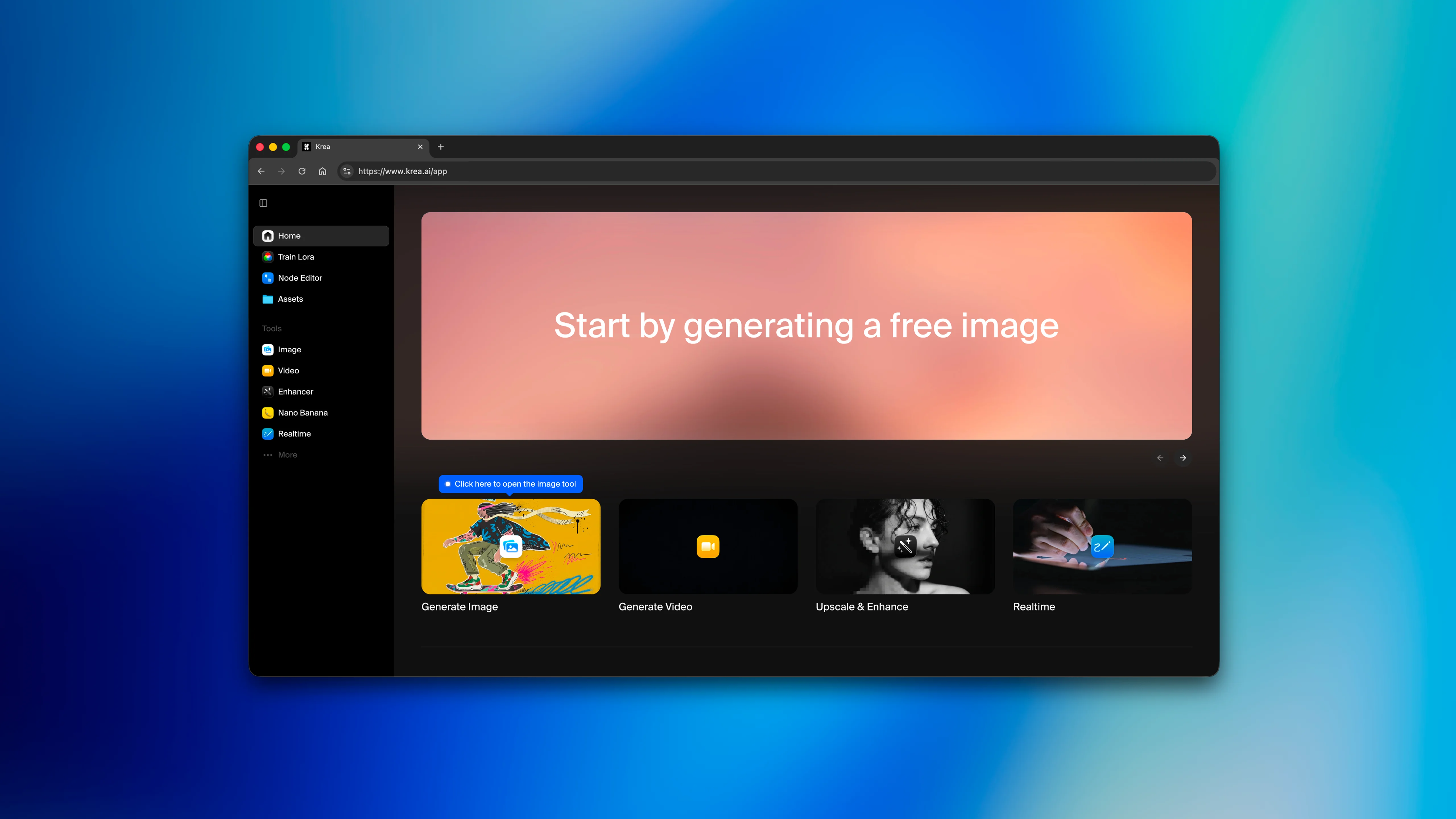
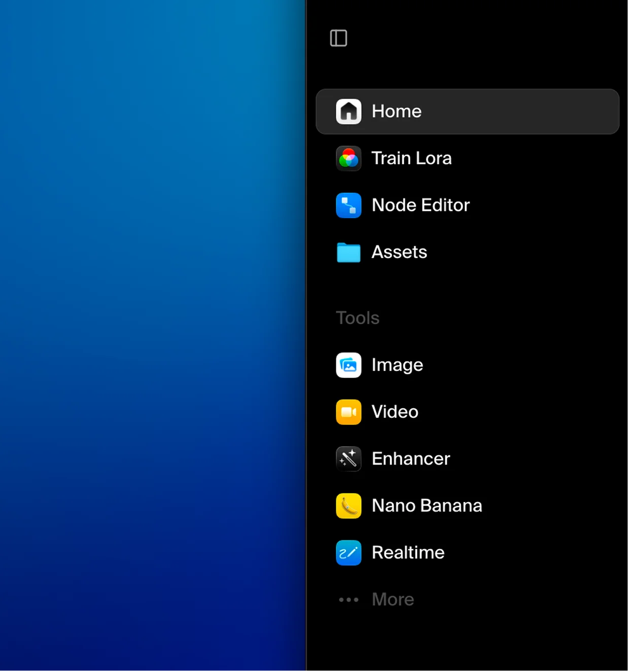
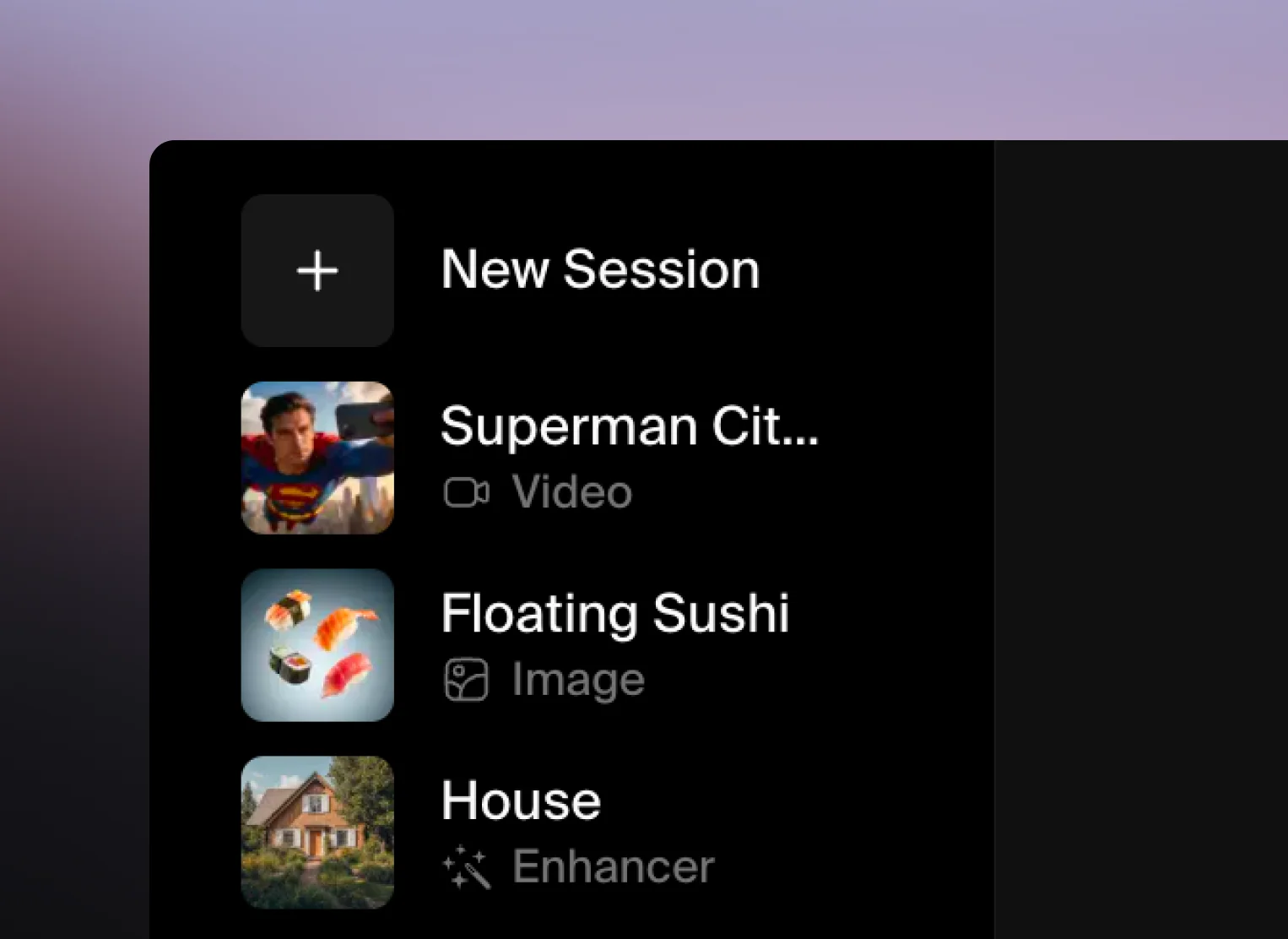
One Sidebar
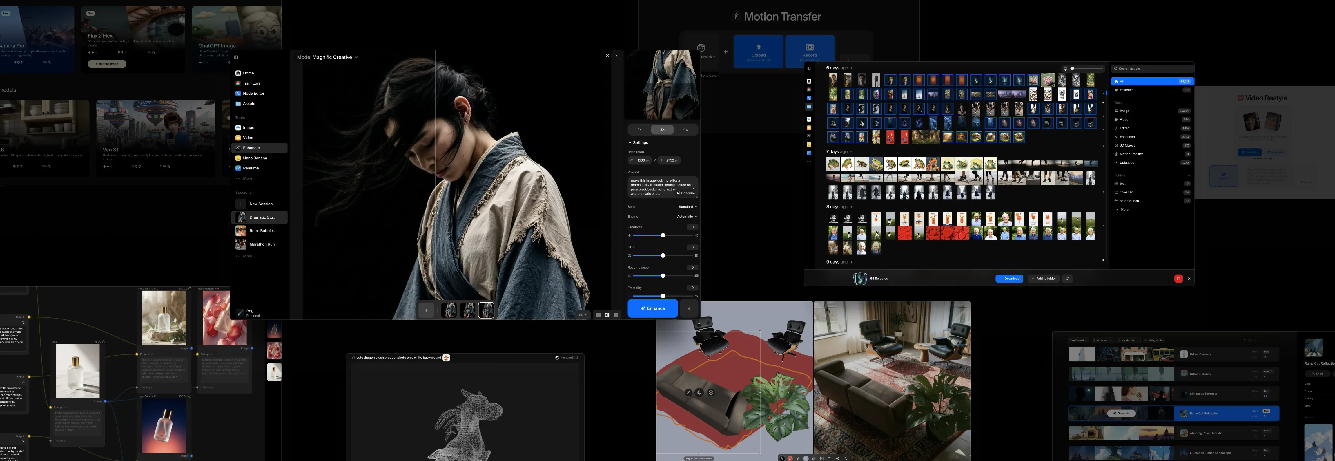
Every tool lives in one place now. Image, video, enhance, edit, 3D, realtime. Sessions carry over between them, and live indicators show what's running so you're not switching tabs to check on a job. We kept hearing from creatives that they'd lose their place jumping between tools, so we fixed that.
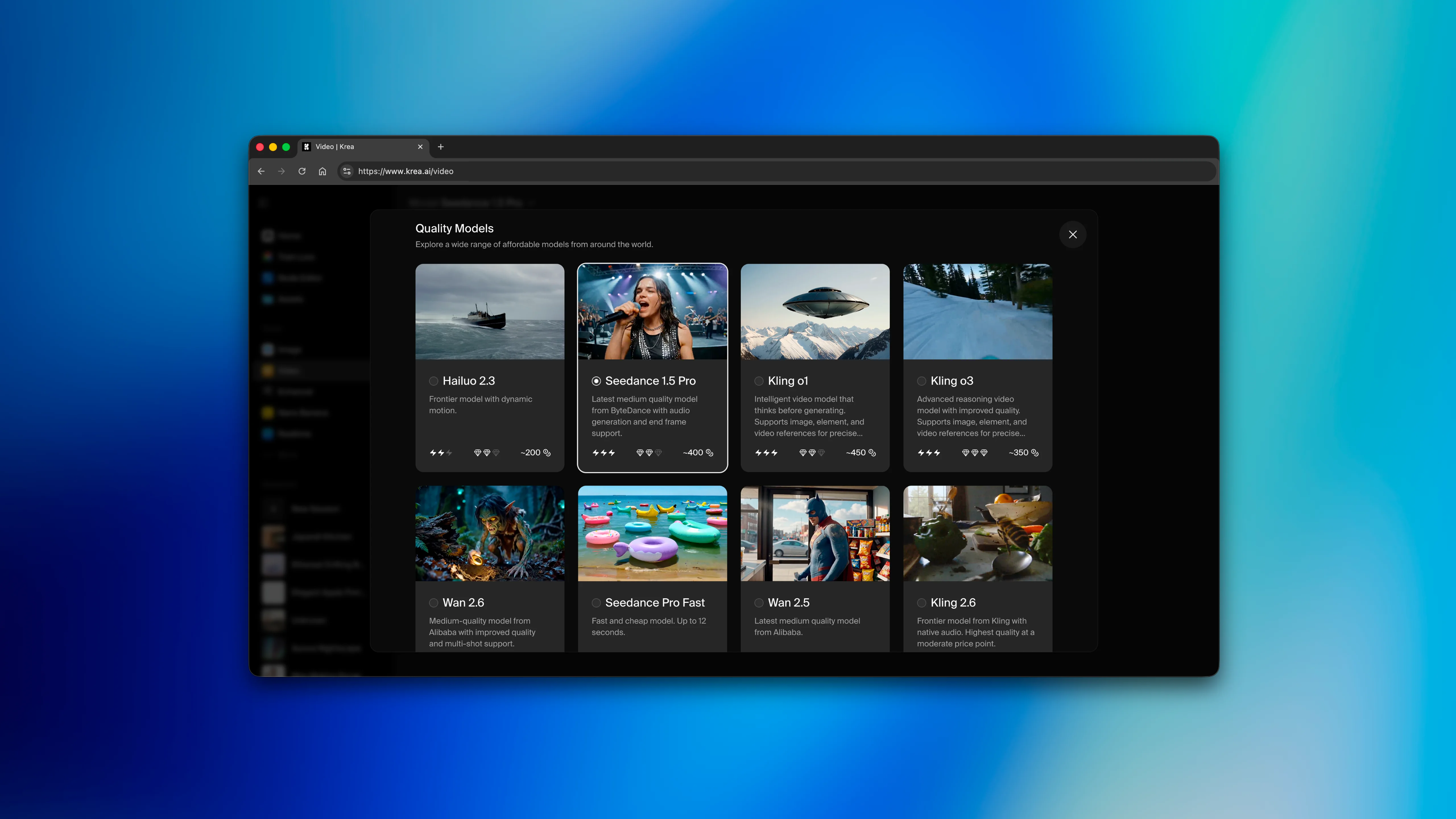
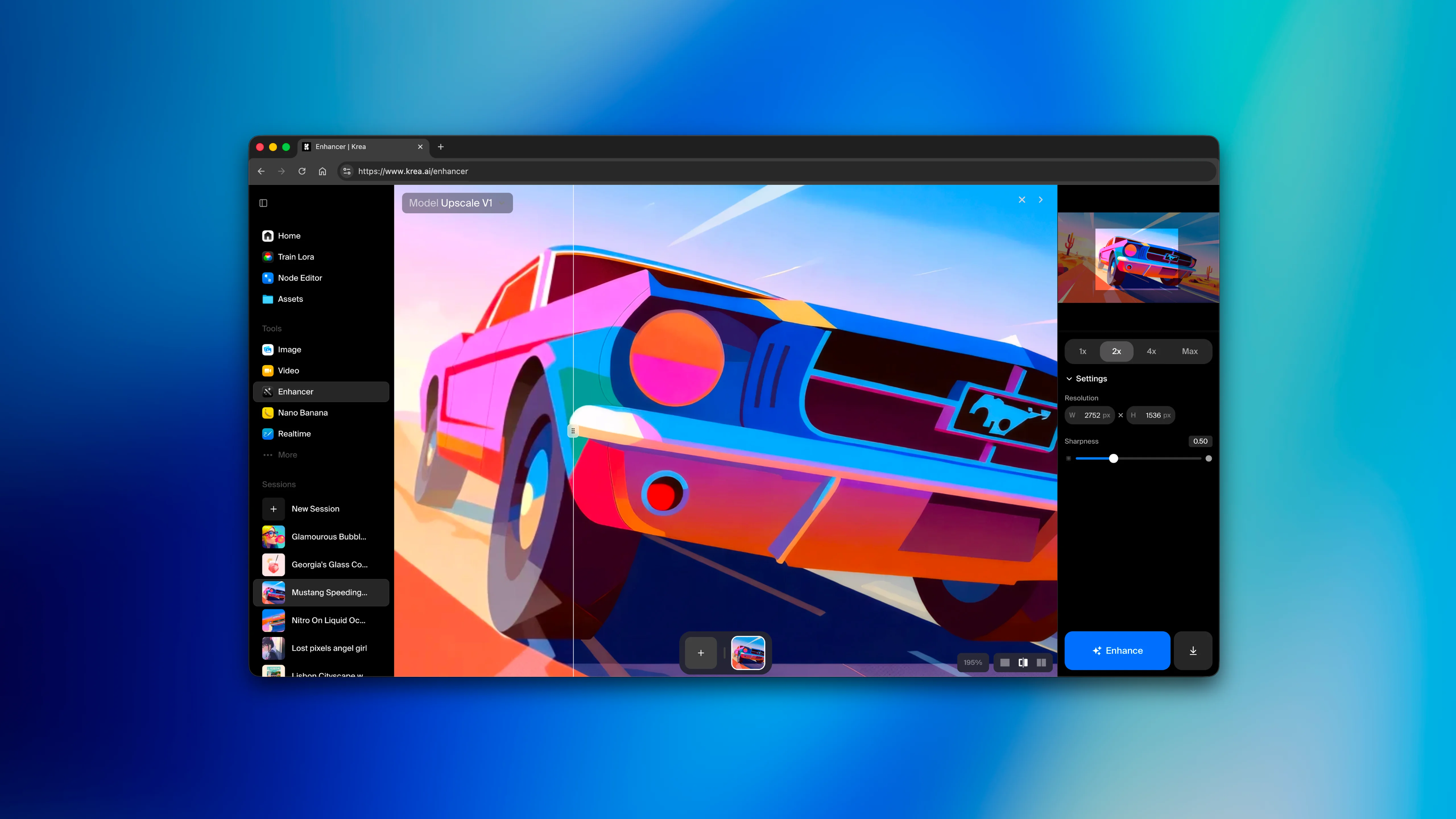
Your Workspace
Every model shows what it costs, how fast it runs, and what it's good at. Picking the right model used to take guessing and research. Now you can quickly scan and get the information you need. We also added the ability to pin the tools you use most and set your defaults.
Speed
The homepage is now a third the size it used to be. We killed animation delays between pages. Sessions also now persist across tools, so if you made something last week you can search for it and pick up where you were.
We also rebuilt mobile from scratch. Older versions of mobile Krea were a desktop app on a smaller screen. This is now its own thing.
Tools in Action
Every tool got the same pass. Cleaner layouts, better defaults, and controls that stay hidden until you need them. Upscale something you just generated by dragging it straight into the enhancer. The quality bar for every screen: open it, do your work, keep moving.
The Principle
Production-grade doesn't have to mean complicated. We've been building around that idea since Krea's inception, and this redesign is our biggest commitment to it yet.
The Krea Team