Architecture studios have a relationship with AI image generation that's been mostly frustrated. The tools generate something gorgeous and obviously fake — five cantilevers where there should be one, doors that go nowhere, windows that glow with no light source — and the rest of the meeting is spent explaining what's wrong instead of moving the design forward.
Krea 2 was built for a different relationship. The model is trained for aesthetic fidelity and creative control — you can pin it to a real architectural style, a real material palette, a real time of day, and a real drawing convention. This article is about how an architecture studio can actually use it, with examples generated for this piece.
Concept stage: drawings, not renders
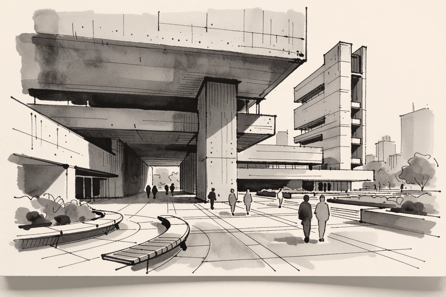
A concept render doesn't need to be photoreal. It often shouldn't be. Early-stage client conversations are easier to have when the image looks like a sketch than when it looks like a finished building — clients argue with finished buildings.
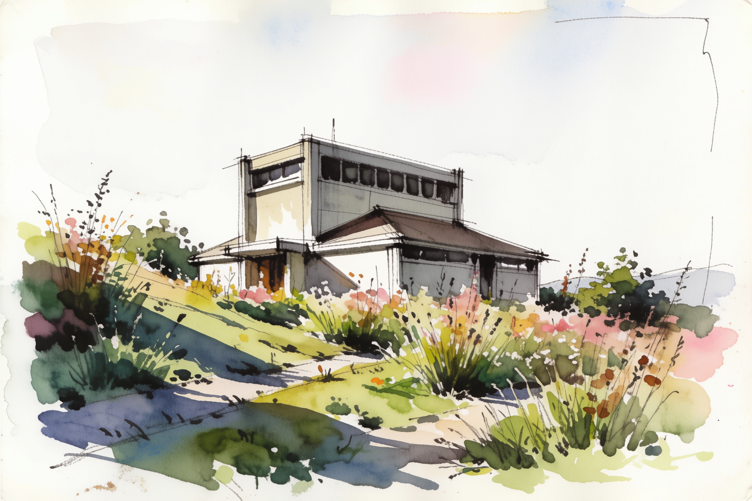
Krea 2 commits to drawing conventions instead of polishing them away. Watercolour, ink wash, marker, axonometric pastel, charcoal — name the medium and the model holds the line.
Concept-stage drawings
Both generated directly from text prompts. You can also drop in a hand sketch as a style reference and Krea 2 will match the line weight.
Photoreal renders, any direction
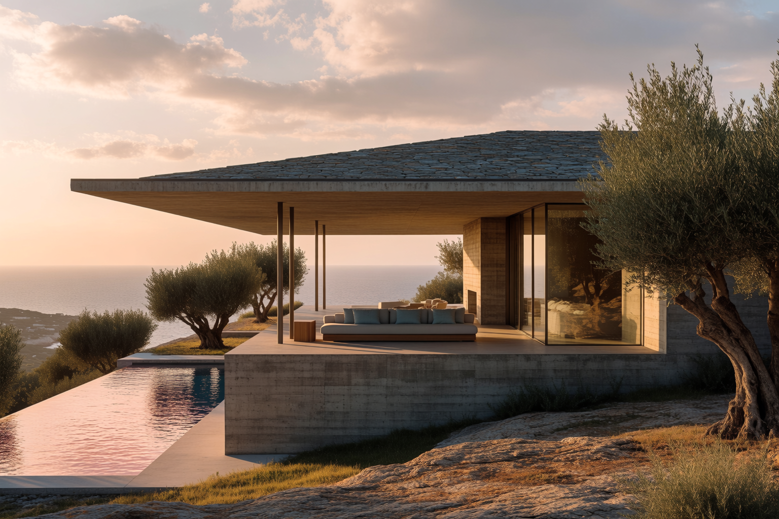
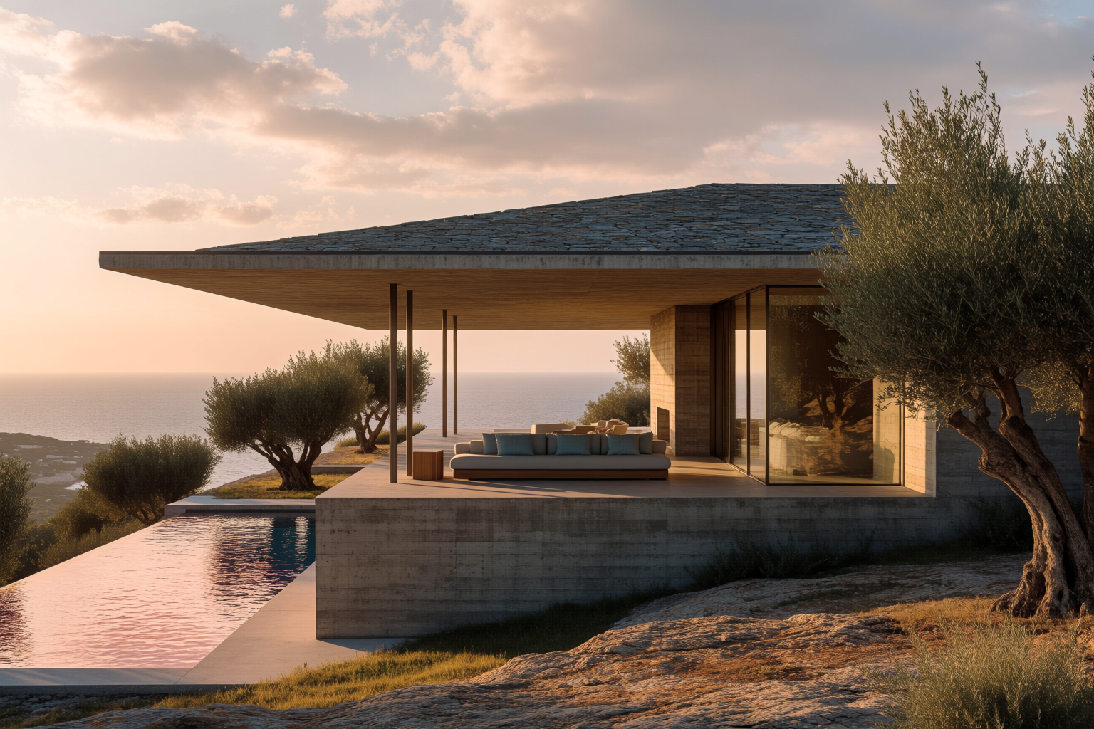
When the studio does want a render — for a client presentation, a competition board, or just to see something — Krea 2's range is the point. The four images below are different building types, different climates, different materials, and different lighting conditions. Same model.
Architectural photography, four directions
Brutalist civic exterior under overcast light, Japandi residential interior with clerestory daylight, mass-timber library interior with glulam structure, Mediterranean courtyard at blue hour.
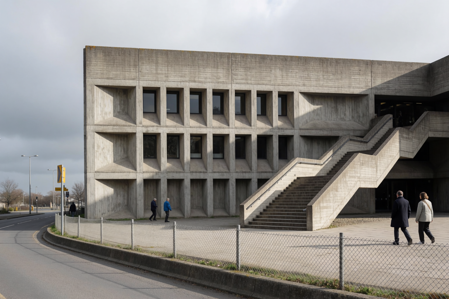
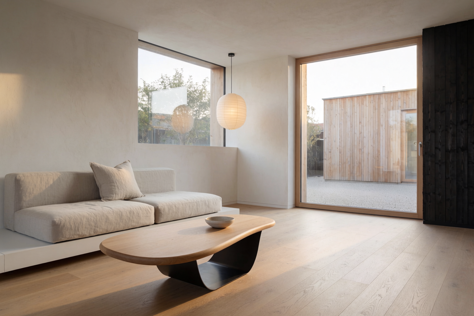
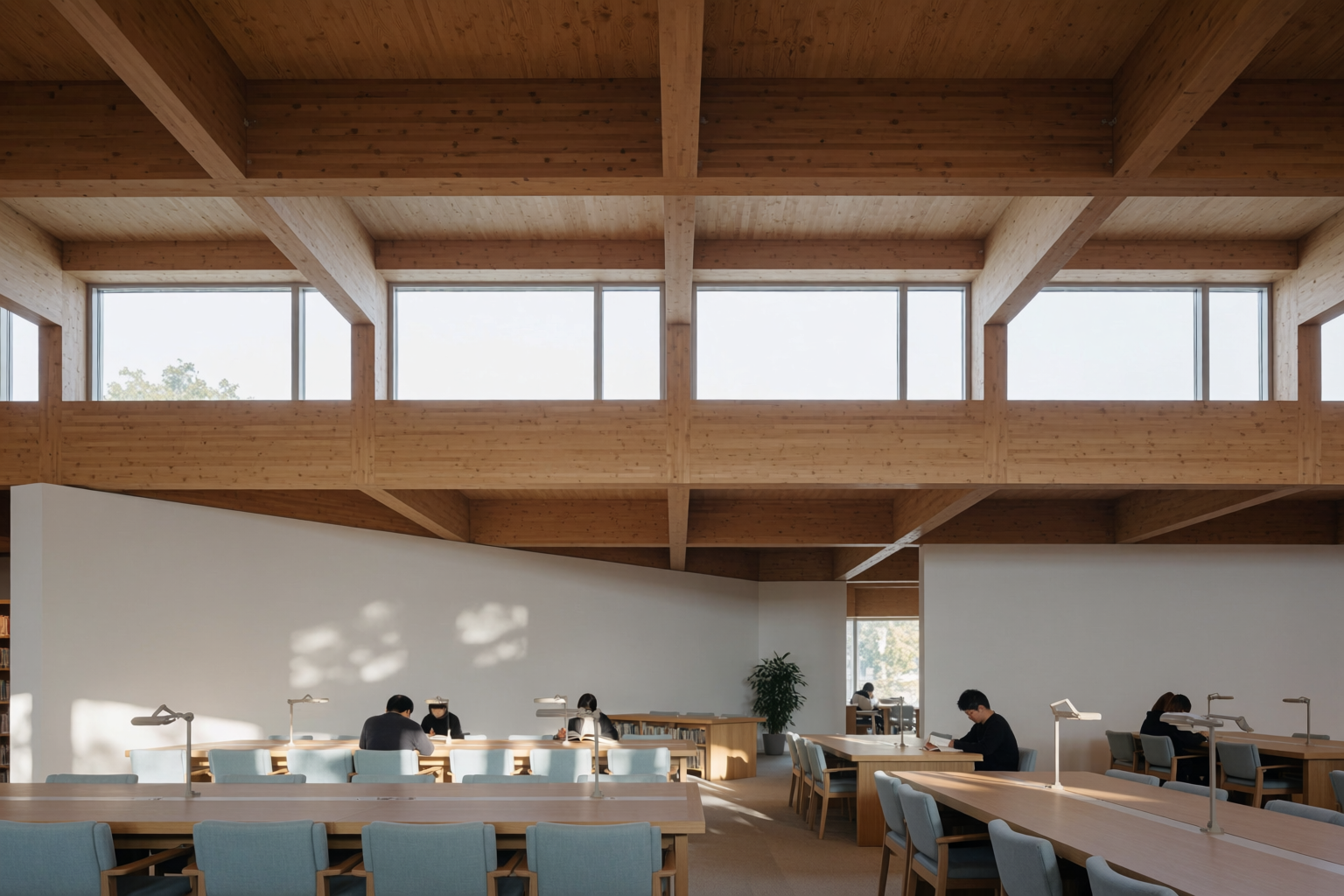
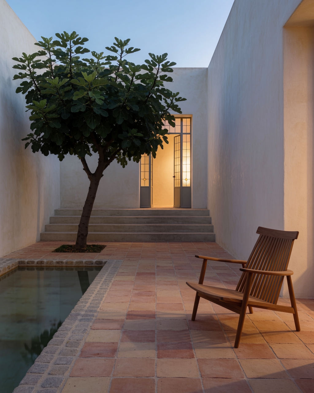
The key shift is that you're not choosing between "a good AI model" and "a good architectural look." You're describing the architecture you want and the model renders it.
From sketch to render
This is the workflow most studios will actually use day-to-day: a partner sketches a massing study on tracing paper, the team needs a render for tomorrow's pin-up, and Krea 2 bridges the gap in one pass.
Drop the sketch in as a style or composition reference, write a one-line prompt about the materials and context, and the model returns a render that respects the sketch's geometry.
Sketch to render
Left — a working pencil sketch of a four-storey residential building. Right — the same massing, rendered as a contemporary brick building in real urban context. The sketch was generated for this demo, but the workflow is the same with a real hand sketch.
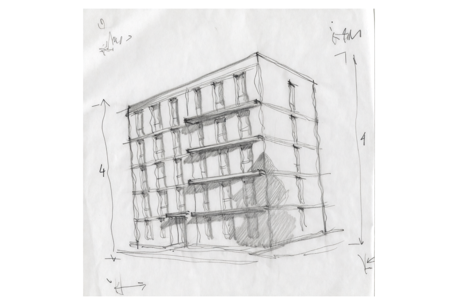
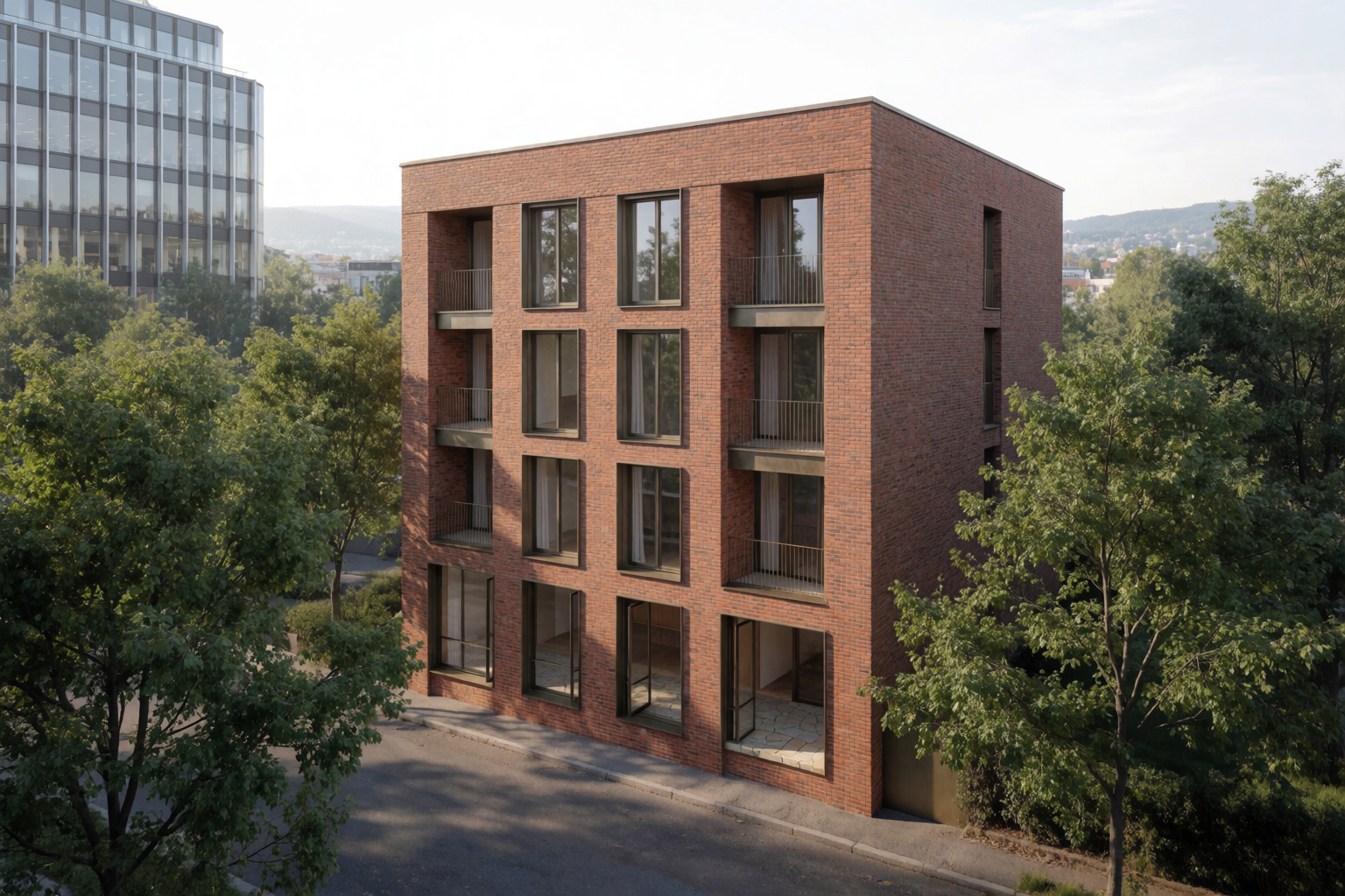
For the cleanest sketch-to-render results, lock the building geometry by using a real sketch as a style reference and push the strength towards the higher end. The model will keep the proportions and let you control the material and lighting story in the prompt.
Studio-specific workflows with moodboards
Most studios have a house aesthetic. The way an HBA project looks isn't the way an OMA project looks, and that's the point. Moodboards let you encode that house aesthetic into the model itself — drop in a curated set of project precedents, completed buildings, material samples, and atmospheric photos, and Krea 2 builds an internal profile of what your studio's work looks like.
Once analysed, the moodboard runs in the background for every generation. New designs feel like the studio's work without anyone having to write a prompt that captures it.
Practical uses:
- Studio house style board. Drop in 30–60 images of your built work and competition submissions. New concept images come back already in your visual language.
- Project-specific board. Build one per project — site photos, material samples, client references, climate references. Every render for that job stays inside the brief.
- Client moodboard. Take the client's Pinterest board, run it through Krea 2, and start showing them their own taste back through the lens of your design.
How a studio team uses Krea 2 day to day
A non-exhaustive list, all jobs Krea 2 is well-suited to:
- Schematic massing studies — explore form options before you commit to BIM
- Material and facade studies — quickly compare brick, board-formed concrete, charred cedar, anodised metal, lime plaster, on the same massing
- Site context and time-of-day variations — same project, dawn / golden hour / dusk / overcast
- Competition imagery — concept watercolours for board layouts
- Interior atmosphere studies — show clients how a room will feel before furniture procurement
- Marketing renders for a finished project — supplement real photography with consistent supporting imagery
- Pitch decks — quickly assemble visual references for RFPs and interviews
- Client onboarding — translate vague client briefs into images you can talk over
A few practical tips
- Be specific about materials. "Concrete" is vague — "board-formed concrete with visible plank texture" lands. Same for "wood" vs "Douglas fir tongue-and-groove ceiling."
- Specify the lighting. "Overcast soft daylight," "low afternoon sun raking across the facade," "blue hour with interior warm tungsten" all give the model a coherent story to render.
- Reference real buildings only when you mean it. Krea 2 is trained on architectural imagery, so naming a Pritzker laureate's style works — but it works strongly. Either commit to that influence or skip the name.
- Keep prompts short and lead with what matters. Long prompts dilute the constraints that count. Lead with building type, then material, then light, then context.
- Use the Edit tool for surgical changes. Once you have an 80% render, switch to Edit to swap a facade material or change the season of the foreground planting without regenerating everything.
Render your next project in Krea 2
Free to try. Style references and moodboards are included on every plan.
Try Krea 2Frequently asked questions for architecture studios
Yes. Drop the sketch into the prompt box as a style reference. The model will preserve the sketch's geometry and apply the materials, lighting, and context you describe in the prompt. Push the style reference strength towards the higher end to lock the lines.
Yes — build a moodboard from your built work and competition submissions. Krea 2 will analyse style, material palette, and atmosphere, and apply that profile to every new generation.
No. Krea 2 is a generative model — it's faster for early-stage exploration, mood, and presentation imagery. For coordinated documentation, daylight studies tied to a real geolocation, or BIM-linked renders, you still want a traditional renderer. Most studios use Krea 2 alongside, not instead of, their existing render pipeline.
Around 15 seconds per image. Krea 2 generations come back fast enough to iterate live in a design review.
Up to 2048 × 2048 directly. Use the Enhancer to upscale further — Krea's upscaler is tuned to preserve material detail rather than smoothing it away.
Krea has team plans. Reach out via the pricing page for studio licensing.